Clarifying Subscription Architecture to Reduce Friction and Increase Conversions
Overview:
The client’s product page was underperforming due to confusion around subscription options and bundle structures. Customers struggled to understand:
Whether they were subscribing or making a one-time purchase
The difference between bottle quantity and subscription duration
How discounts were applied
Why pricing changed across options
This confusion created friction at a high-intent moment — the purchase decision.
The goal was to simplify the subscription model, improve pricing transparency, and create a clearer decision hierarchy to increase add-to-cart rates and checkout progression.
UX & CRO Improvements Implemented:
To address the low conversion rate, I conducted a comprehensive UX audit and heuristic analysis of the existing product page. Based on data insights (including click tracking and scroll depth) and eCommerce best practices, the following optimizations were implemented:
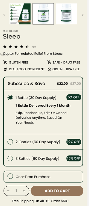
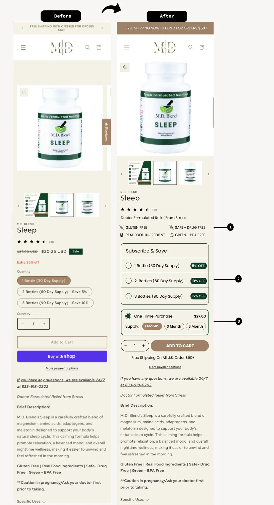
Strengthened Above-the-Fold Trust & Differentiation
Improved hierarchy under product title to reinforce credibility
Added clear UVP icons: Gluten Free, Drug-Free, Real Food Ingredient, BPA-Free.
Added clear UVP icons: Gluten Free, Drug-Free, Real Food Ingredient, BPA-Free
Re-Architected the Subscription Model for Clarity
- Highlighted savings percentages directly next to each tier (5%, 10%, 15%)
- Visually separated One-Time Purchase from Subscription
- Introduced a clearly separated “Subscribe & Save” container
Clarified Monthly Supply & Delivery Expectations (see below)
-Explicitly stated: “1 Bottle Delivered Every 1 Month”-Added microcopy explaining flexibility:
Skip
Reschedule
Edit
Cancel anytime
Included supply duration context (30-day, 60-day, 90-day supply)