Product Page Redesign for Higher Conversions
Nine targeted improvements built trust, education, and scannability into Venus Vitality's hormone-balance supplement product page.
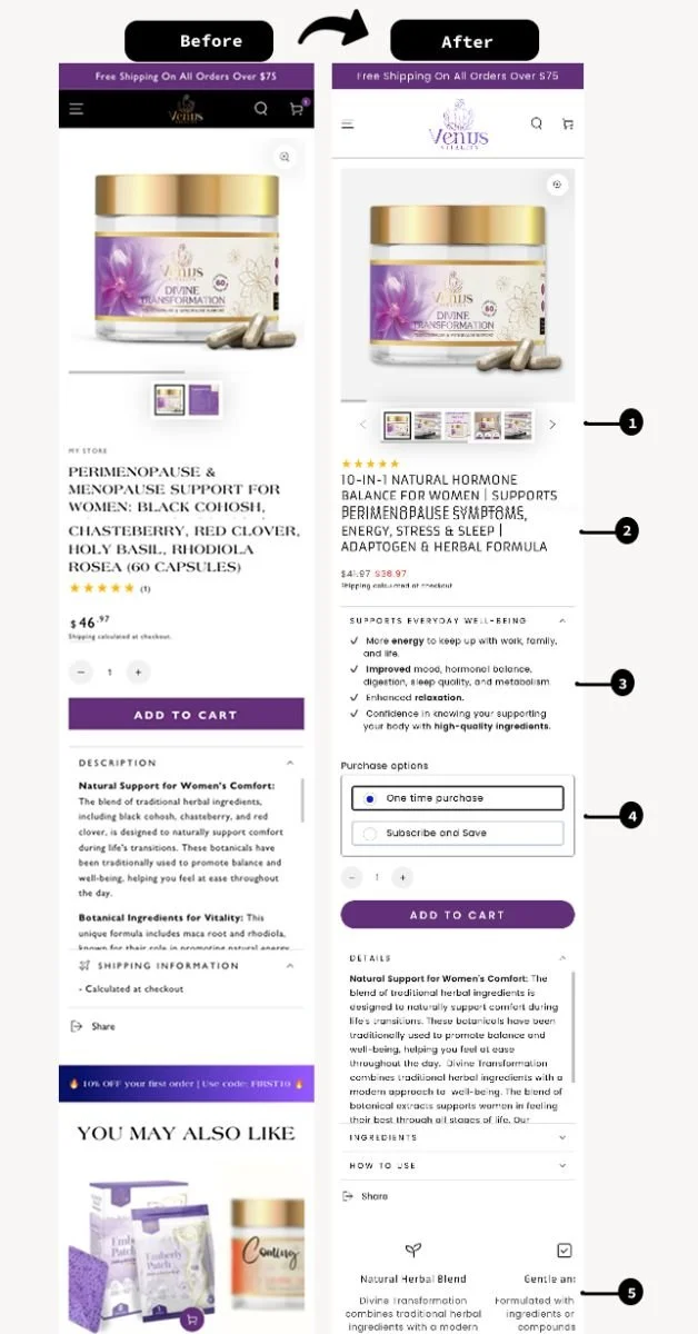
The original page suffered from poor information hierarchy, low scannability, limited trust signals, and missed opportunities for persuasive design — on top of weak value proposition visibility, thin product education, and too few confidence-building elements for a considered purchase.
"Simplifying product education, without overwhelming the user, increases trust and improves conversion readiness."
What We Built
01. Visual Hierarchy Rebuild
Title, ratings, and pricing repositioned below imagery for a clearer scan path.
02. Benefits-Driven Headline
Rewritten to lead with the product's unique value, not a generic descriptor.
03. Subscribe & Save
Added to support retention starting from the first purchase.
04. Expandable Description Sections
Collapsible content kept the page scannable without cutting detail.
05. Visual Ingredient Section
Built transparency and education directly into the layout.
06. Video Testimonials
Real customers speaking to results, placed for maximum visibility.
07. Scientific Benefit Icons
Explanatory blocks made product claims easier to trust at a glance.
08. Collapsible FAQ
Addressed common customer concerns without adding to page length.
"Content simplification builds trust, prioritizing benefits and social proof strengthens first impressions, and interactive elements balance storytelling with checkout accessibility."