Clarifying Subscription Architecture to Reduce Friction and Increase Conversions
For M.D. Blend, a confusing subscription and pricing structure was rebuilt into a transparent, easy-to-scan purchase decision.
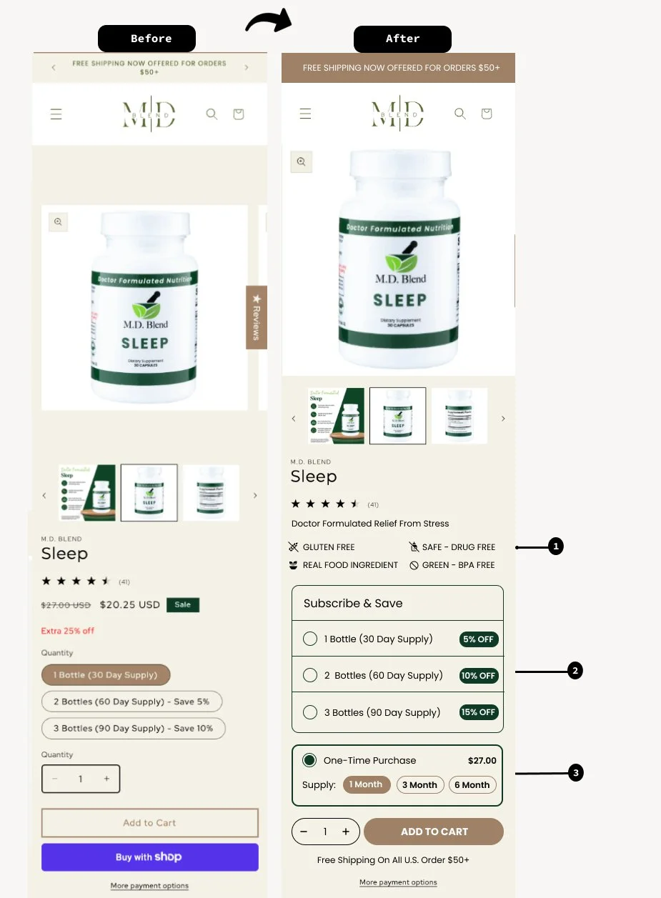
Customers were confused on multiple fronts: whether they were subscribing or making a one-time purchase, the difference between bottle quantity and subscription duration, how discounts were applied, and why pricing changed across options. That confusion was showing up as friction at the exact moment customers were ready to buy.
A UX audit and heuristic analysis, combined with click tracking and scroll depth data, showed customers struggling with subscription model comprehension and pricing transparency right at the highest-intent moment on the page.
Rebuild the subscription offer around plain language and visible savings, so the value of subscribing is obvious rather than inferred.
What We Built
01. Above-the-Fold Trust Signals
UVP icons (Gluten Free, Drug-Free, Real Food Ingredients, BPA-Free) reinforced credibility immediately.
02. Re-Architected Subscription Model
Visible savings percentages (5%, 10%, 15%) made the value of subscribing explicit.
03. Separated Purchase Paths
One-Time Purchase and Subscribe & Save visually distinguished instead of blended together.
04. Clear Delivery Expectations
Plain-language cadence, e.g. "1 Bottle Delivered Every 1 Month," plus flexibility microcopy: skip, reschedule, edit, or cancel anytime.
"Reducing subscription confusion through clearer architecture and transparent pricing directly impacts conversion by removing friction from the purchase decision."