GoldFi: Product Detail Page Redesign
Restructured trust signals and variant selection to fix a mobile conversion problem hiding in plain sight.
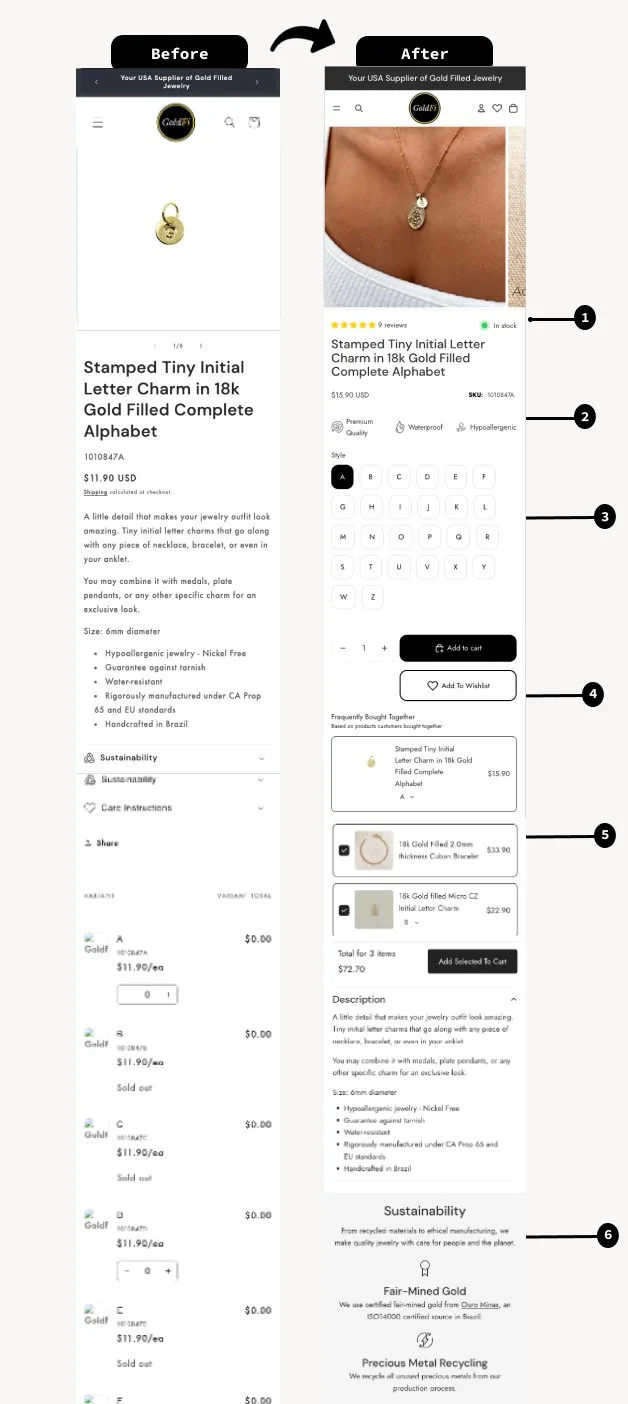
Critical trust signals — reviews, stock status — were missing above the fold. Product options appeared scattered and confusing across multiple listings, with no clear or immediate path to purchase. Cross-sell and sustainability messaging went largely unused. The page lacked clarity, urgency, and confidence, especially for first-time visitors.
Customer reviews were analyzed to uncover real purchase drivers and concerns, which then informed the messaging and value propositions surfaced above the fold.
Give first-time visitors the trust, urgency, and clarity they need to buy with confidence.
What We Built
01. Trust & Urgency Signals
Reviews added near the title, "Few left in stock" messaging introduced, and the title shortened to surface more actionable content.
02. UVPs from Customer Language
Real customer feedback themes surfaced in a scannable format.
03. Variant Selection Restructured
Proper product variants replaced a confusing one-line structure for a clear Add to Cart experience.
04. Wishlist Functionality
Support for browsing, saving items, and deferred purchase decisions.
05. Cross-Sell Section
"Frequently Bought Together" added below the wishlist to lift order value.
06. Sustainability Icons
A dedicated section placed beneath the product description.
"Small but strategic UX improvements on a product page can significantly impact conversion performance."